Shape & Sate

Property Consultancy

Client:

Shape & Sate

Year:

2026

Scope:

Naming

,

Brand Identity

,

Social Media

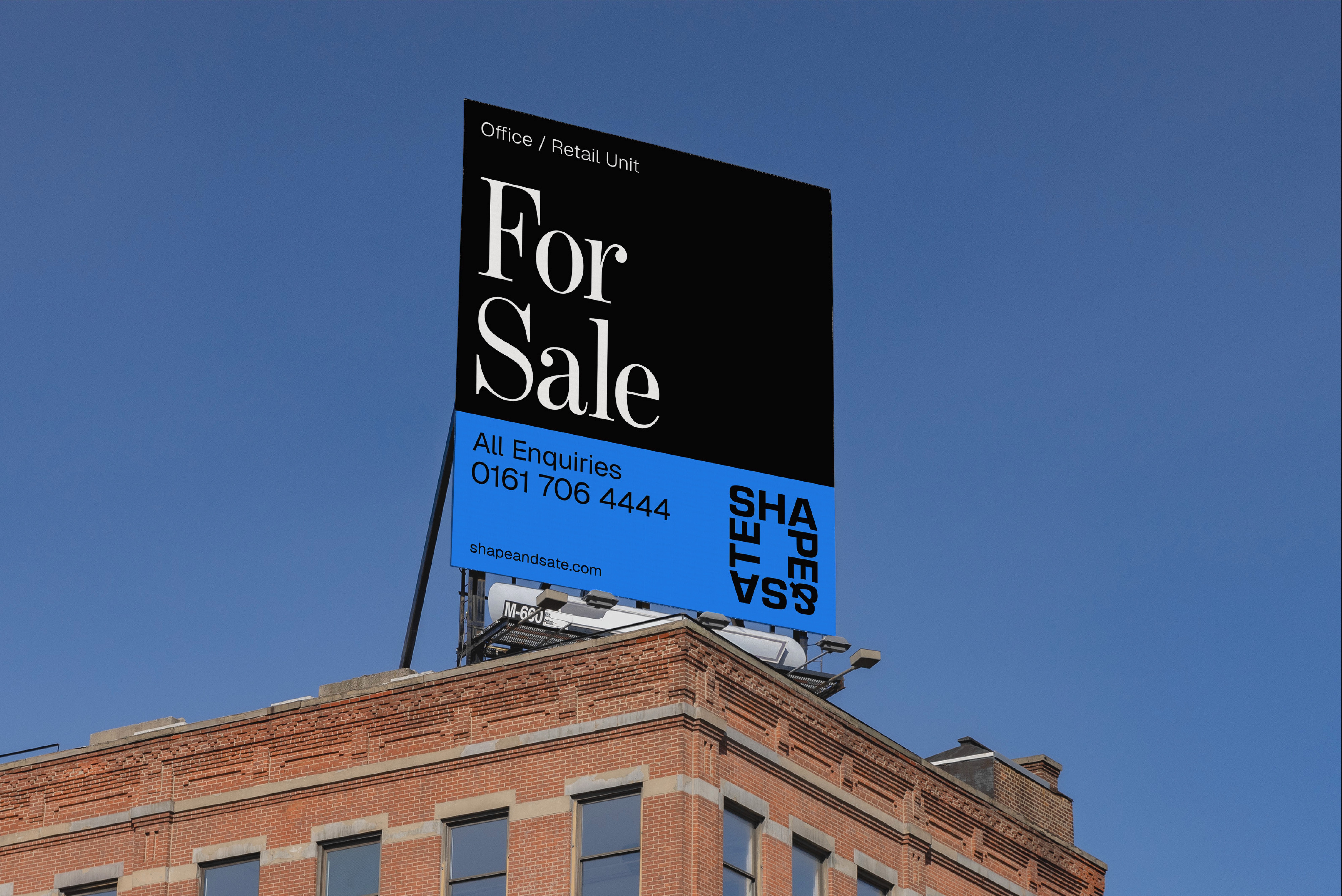
Shape & Sate Property Consultancy brand identity — For Sale billboard on Manchester building exterior showing SHAPE&SATE wordmark logo system in blue and white
Batch.Works logo over a photo of a box of 3D printed objects
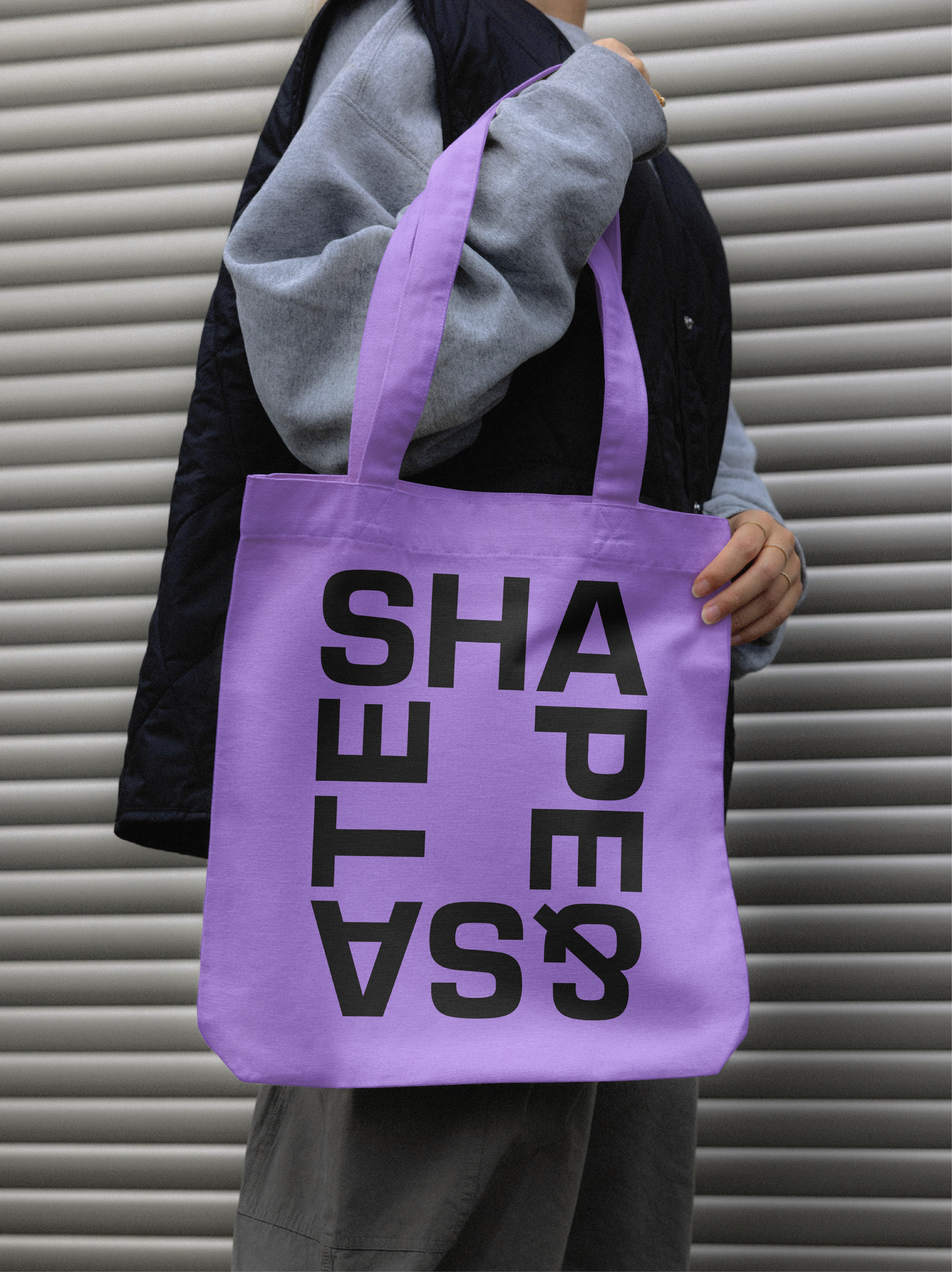
Shape & Sate Property Consultancy brand identity — purple tote bag with SHAPE&SATE logo mark held against corrugated metal background
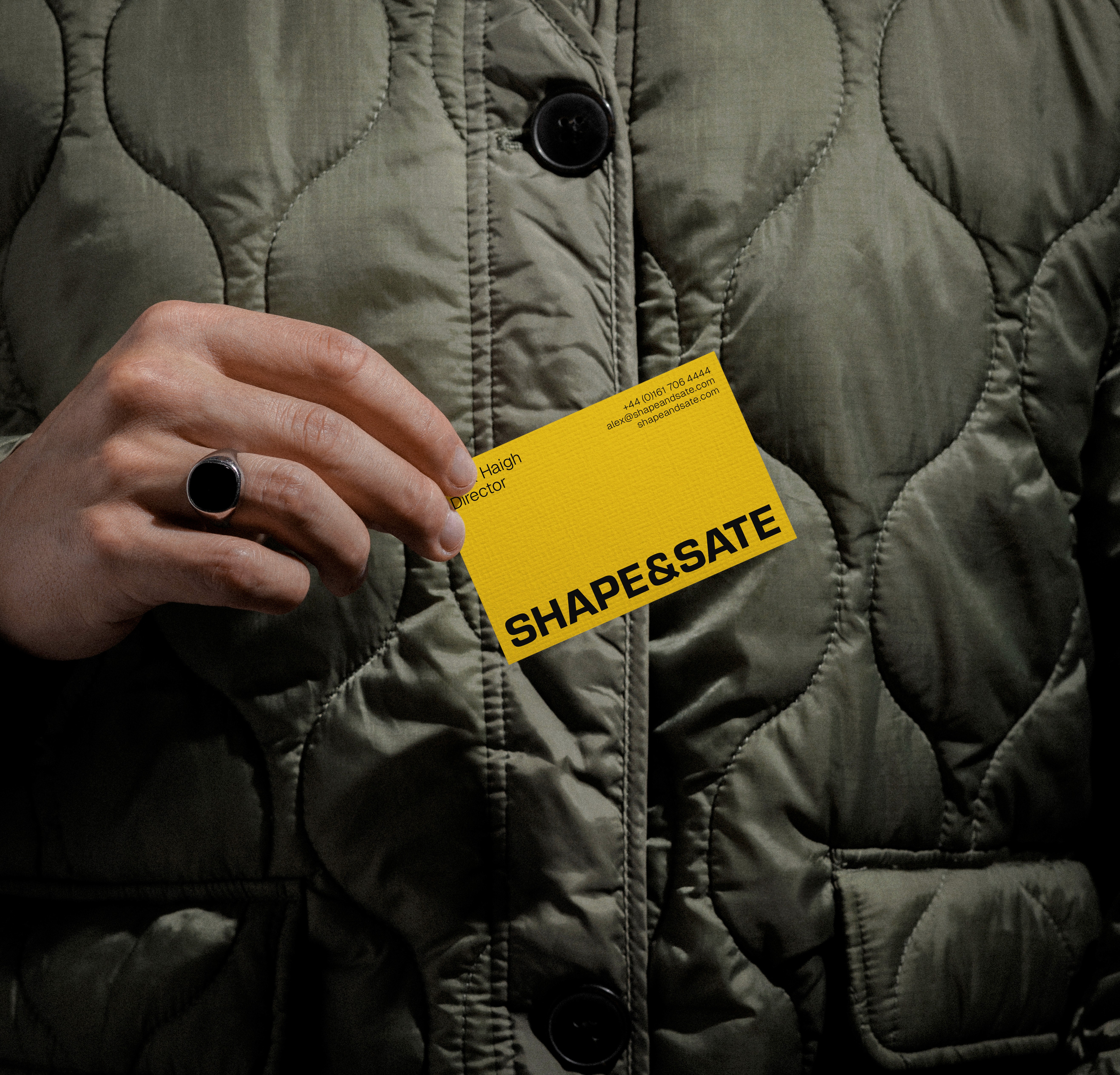
Shape & Sate Property Consultancy brand identity — yellow business card with SHAPE&SATE wordmark on dark jacket

Shape & Sate is a Manchester-based boutique property consultancy. Curating retail and leisure spaces for tenants and landlords across the North.
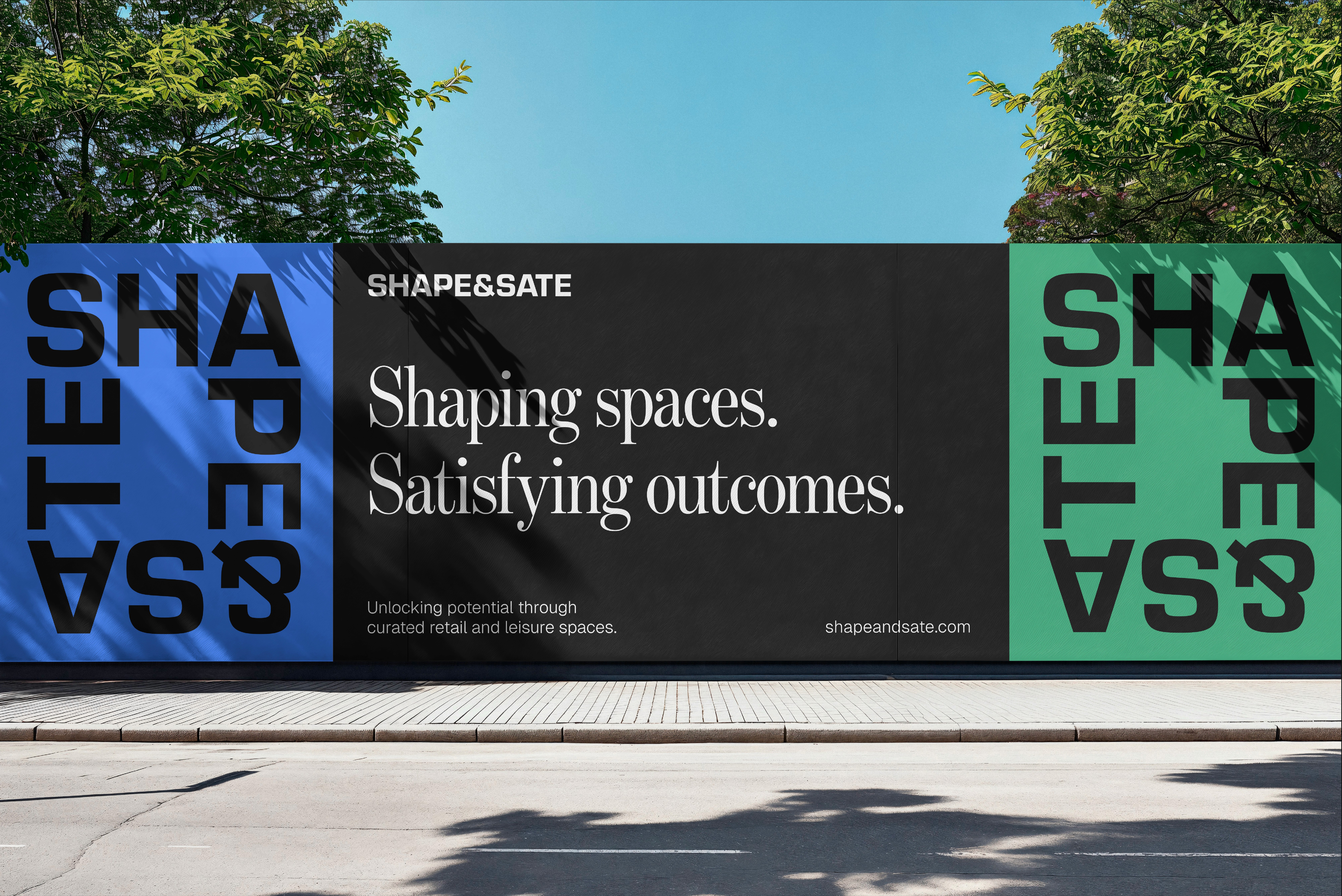
Shape & Sate Property Consultancy brand identity — outdoor hoarding showing Shaping spaces. Satisfying outcomes. headline with SHAPE&SATE logo on blue and green
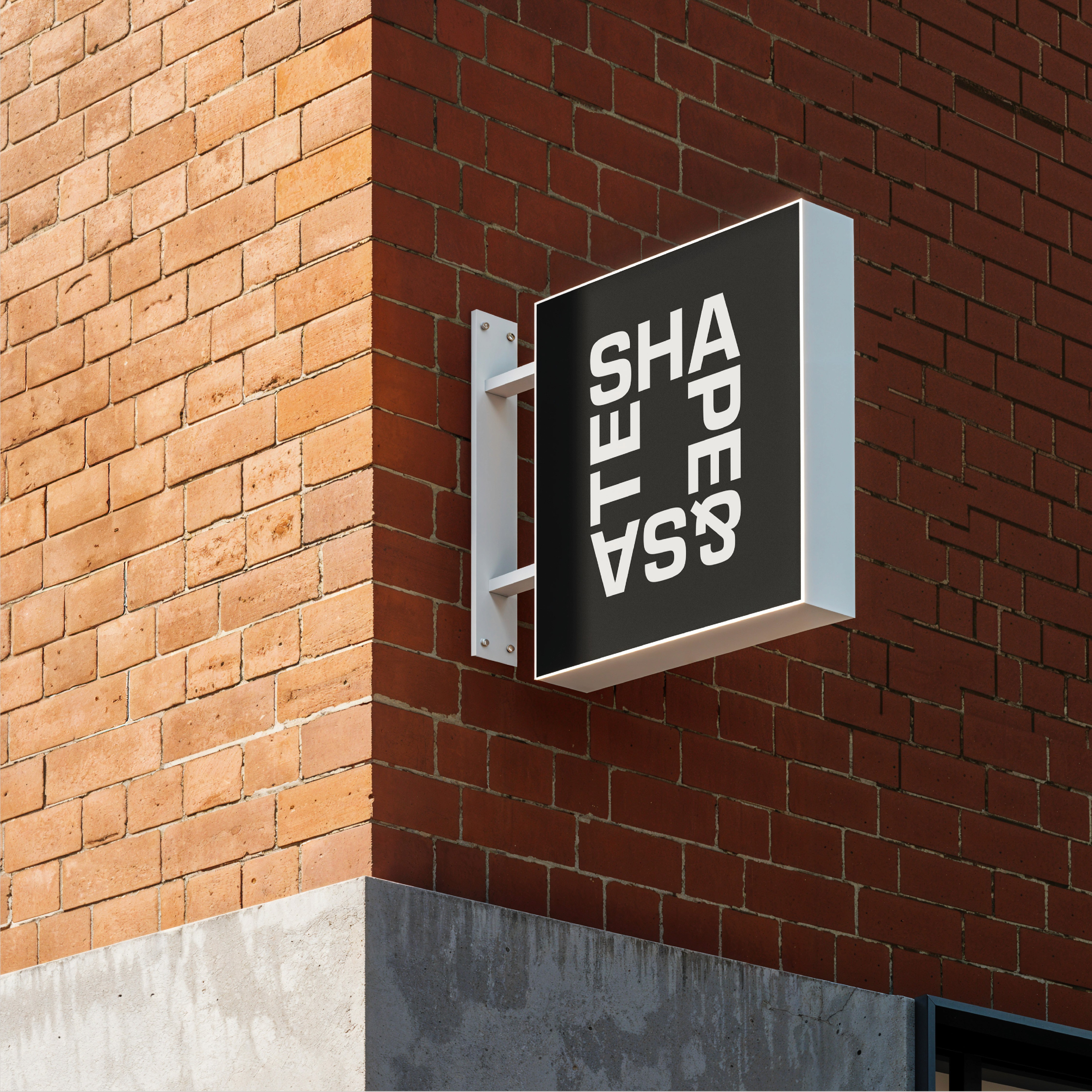
Shape & Sate Property Consultancy brand identity — building mounted sign with SHAPE&SATE wordmark on brick exterior Manchester street
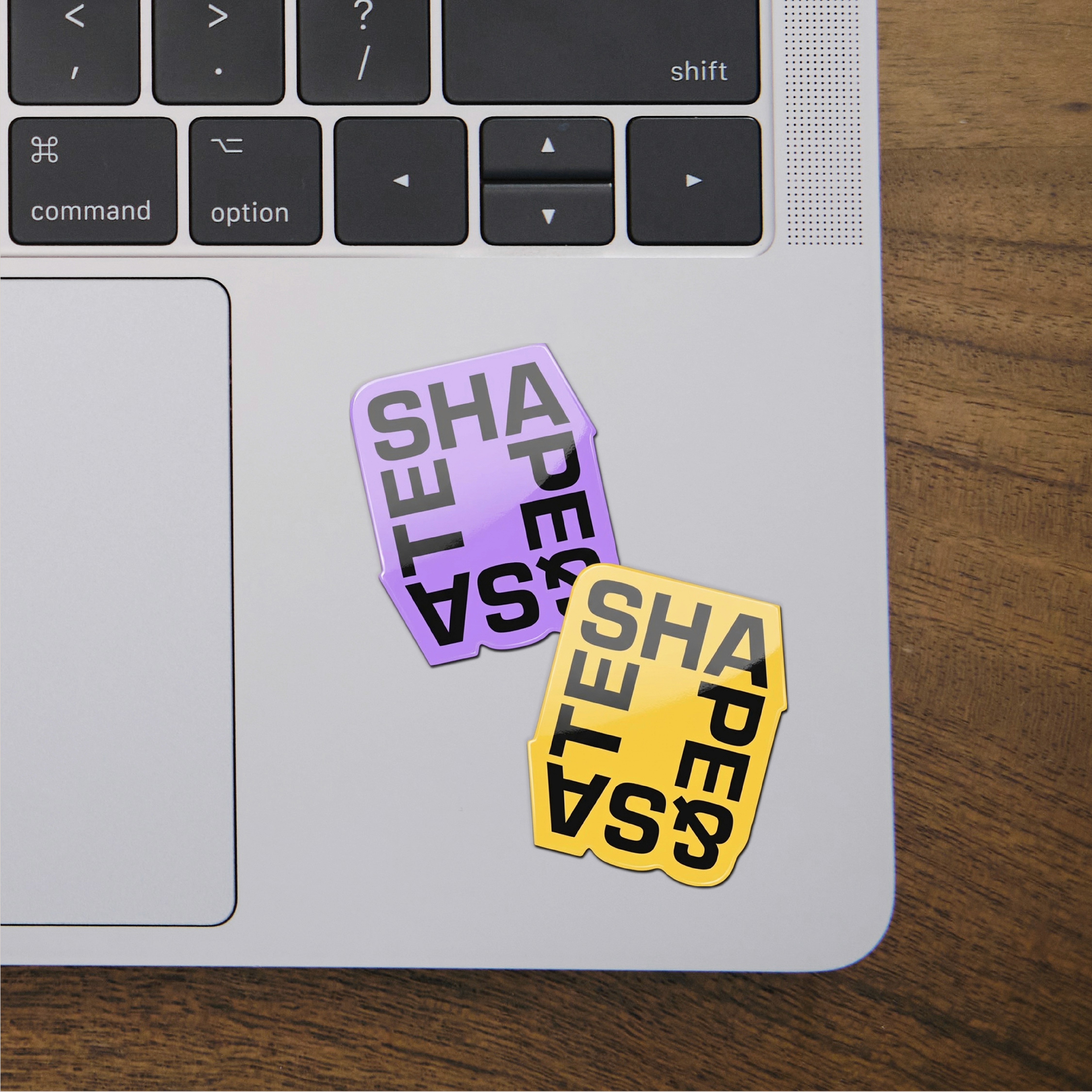
Shape & Sate Property Consultancy brand identity — large scale SHAPE&SATE wordmark typographic treatment in black
Shape & Sate Property Consultancy brand identity — LinkedIn profile page for Alex Haigh showing Shaping spaces. Satisfying outcomes. brand messaging applied to social media
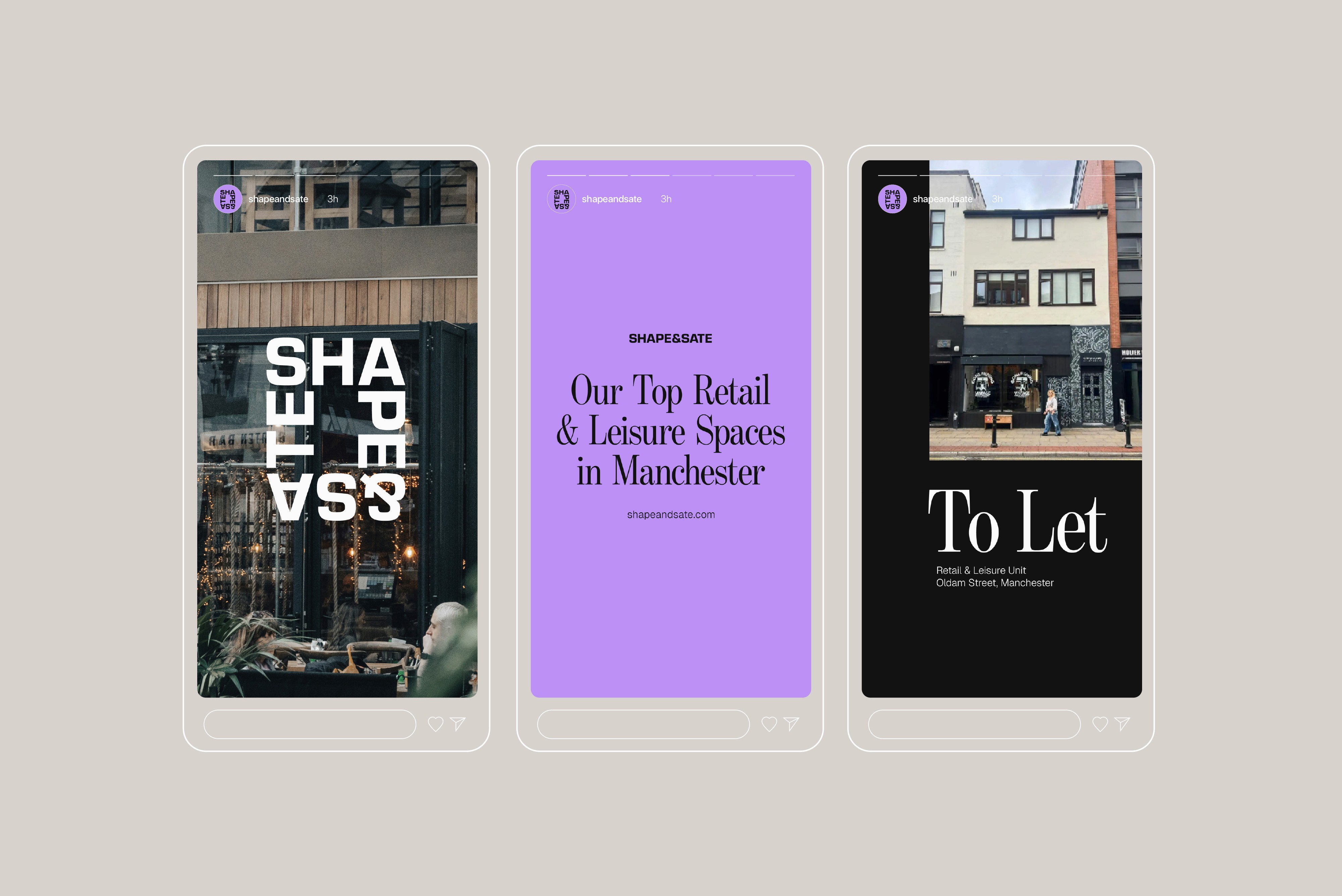
Shape & Sate Property Consultancy brand identity — Instagram profile page showing brand identity system applied to social media with follower metrics
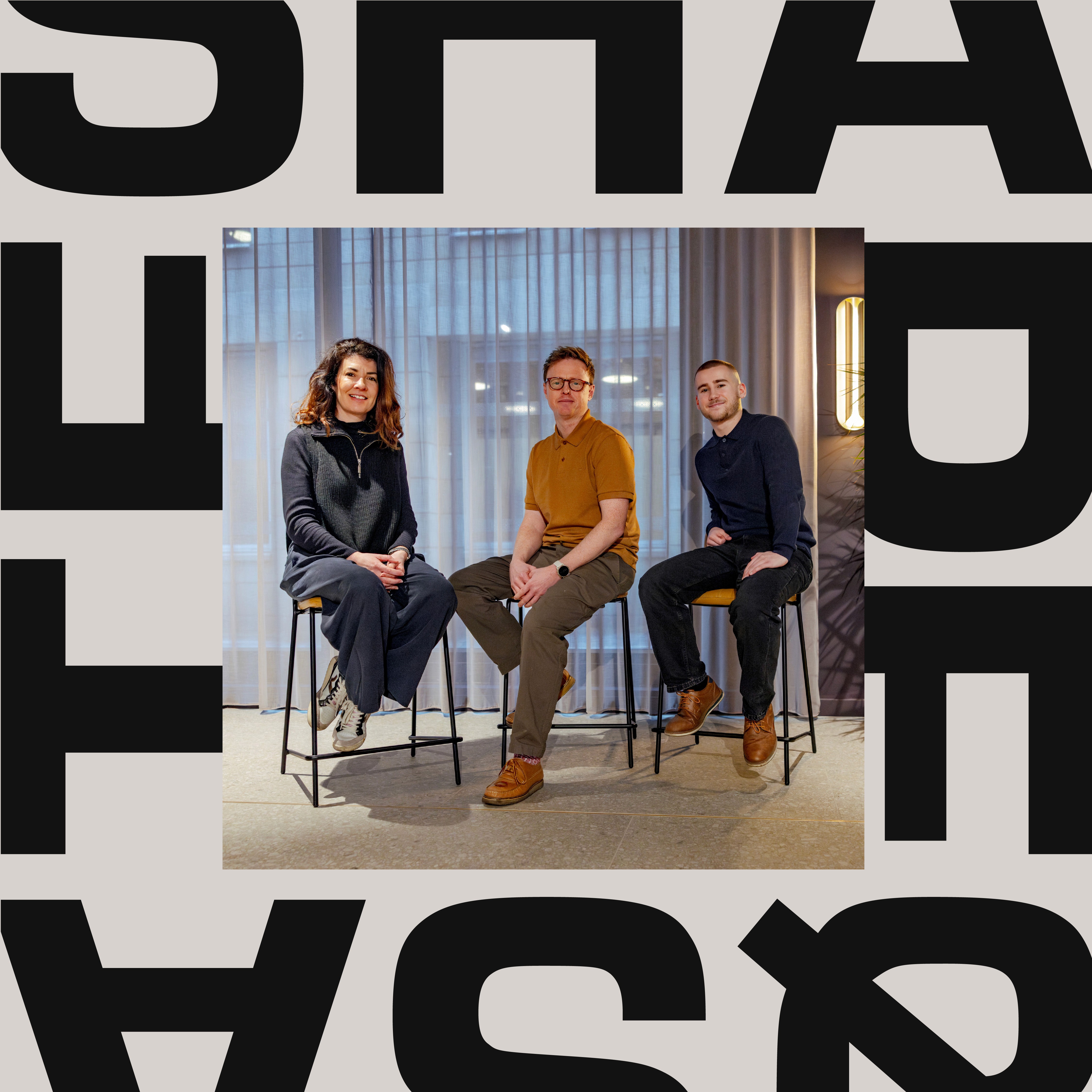
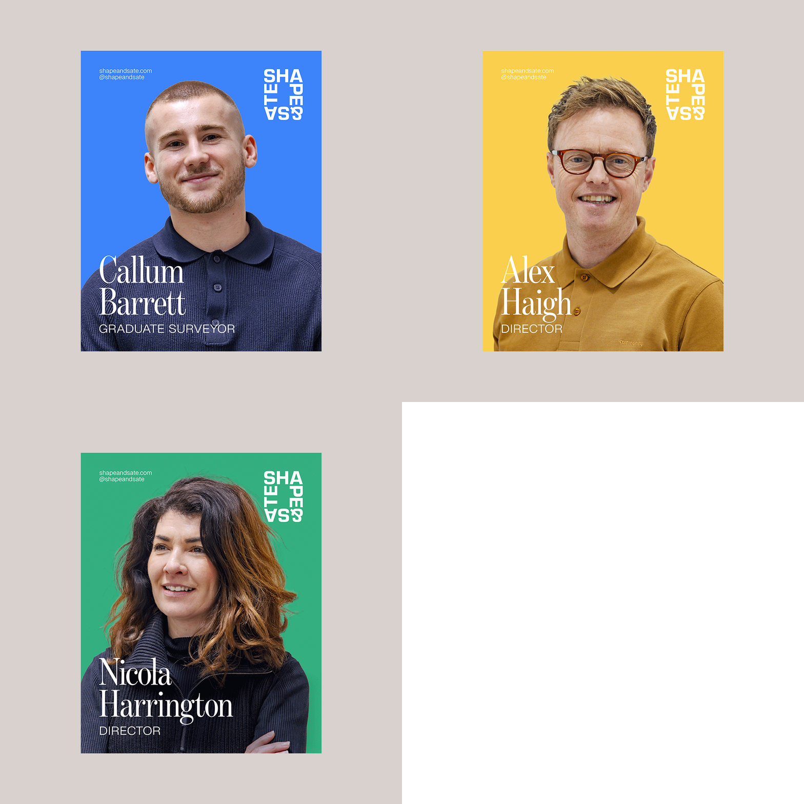
Shape & Sate Property Consultancy brand identity — animated social media posts featuring founders with SHAPE&SATE brand identity on colour backgrounds
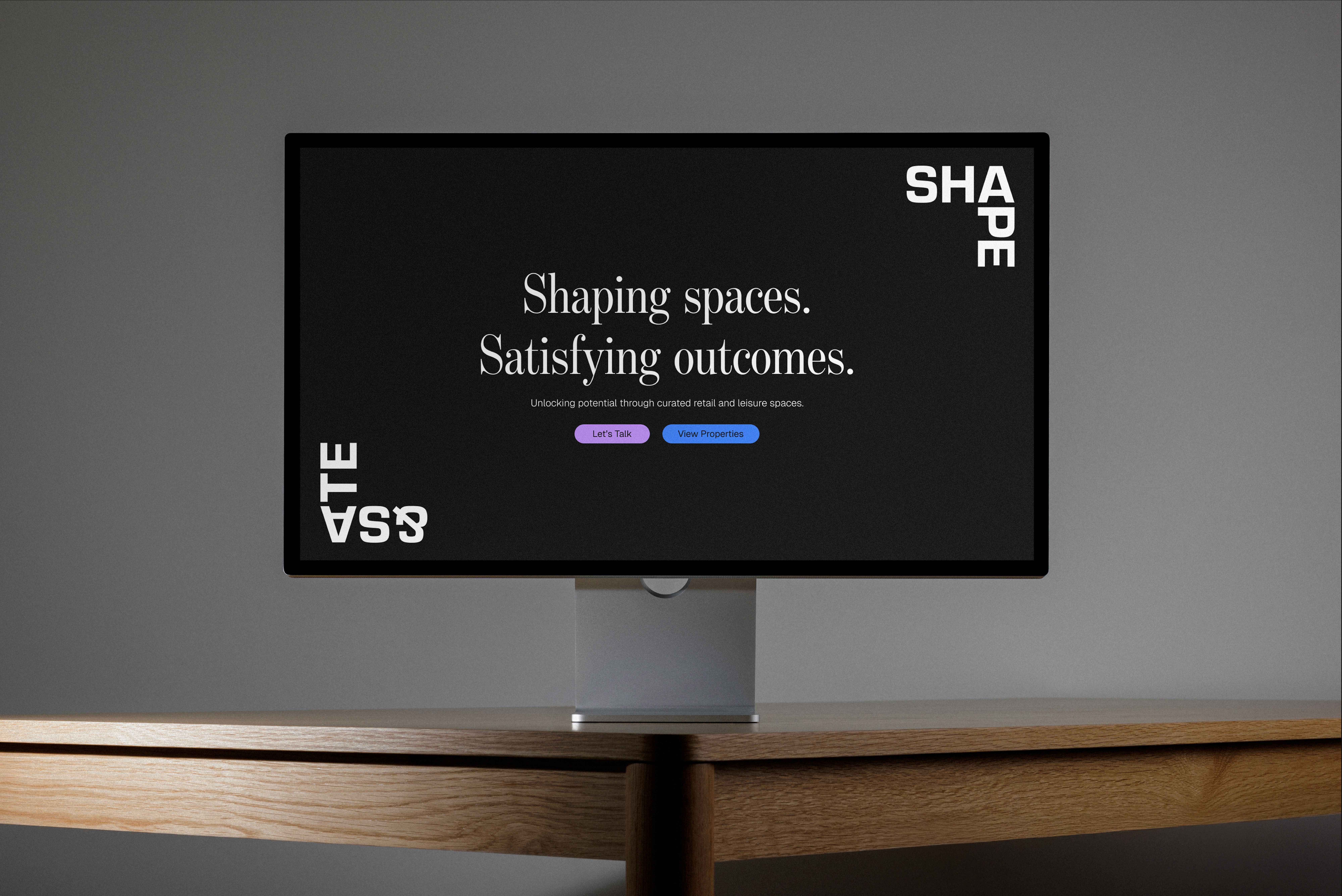
Shape & Sate Property Consultancy brand identity — website landing page design on monitor showing Shaping spaces. Satisfying outcomes. headline with SHAPE&SATE wordmark system

Project Description

A new kind of consultancy, built around a clear mission: to curate opportunity through considered support and advice. Pragmatic. Affable. Innovative.

This thinking shaped everything – including the name. Shape & Sate reflects the balance between carefully crafted spaces and outcomes that truly satisfy. Two words. One philosophy.

The visual identity centres on a bold typographic wordmark that works in isolation and as a secondary frame across all brand assets, brought to life through motion. A vibrant five-colour palette that stands apart from every other competitor in the space, and a design system comprehensive enough to take Shape & Sate from socials to marketing boards on the streets of Manchester and beyond.

Shaping spaces. Satisfying outcomes.
More projects